Event Coordinator App
Prototyping & User Testing
Overview
Freelance vendors and contractors working together on short term events and projects would benefit from a tool that allows them to streamline event management in one place. Where they can effortlessly coordinate diverse schedules, communicate as a group or individually, and share assets. With multiple events/projects in a user’s queue, each one is a self contained ‘notebook’ so that there is no confusion about which caterer in your contact list you need to message or which florist you need to credit in your images.
- Project TypeStudent Project
- RolePrototyping & User Testing
- ToolsPen/Paper, Axure, Google Forms
- DeliverablesInteractive Prototype & Presentation
Paper Prototype & User Testing
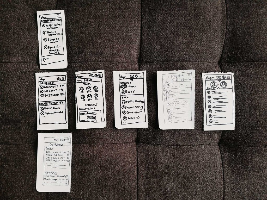
A simplified, mobile version of this app would be one of the most important components so that users could access messaging and calendar functionality while on the job. This is why I decided to focus my prototype project on a mobile view and testing was primarily concerned with navigation and messaging functionality.
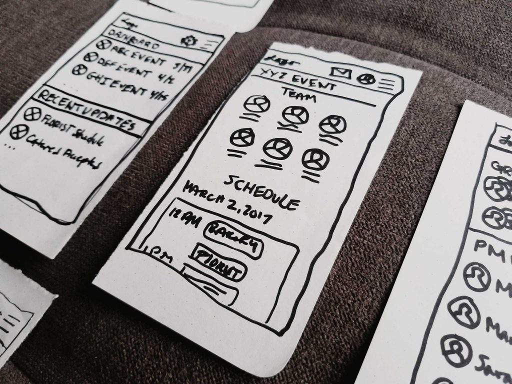
I began by first doing some sketching exercises and refining my initial ideas. The best of these I was then able to use as paper prototypes. I tested the paper prototype with a few users and from this was able to come away with a few findings, most helpful of which were that:
- The idea of siloing events/projects into their own all encompassing sections (or notebooks) makes sense
- An open chat window including chat screen, general chat navigation, and controls is too much on one mobile screen
- More context giving placeholder content is needed for better understanding while testing
V.01 Prototype
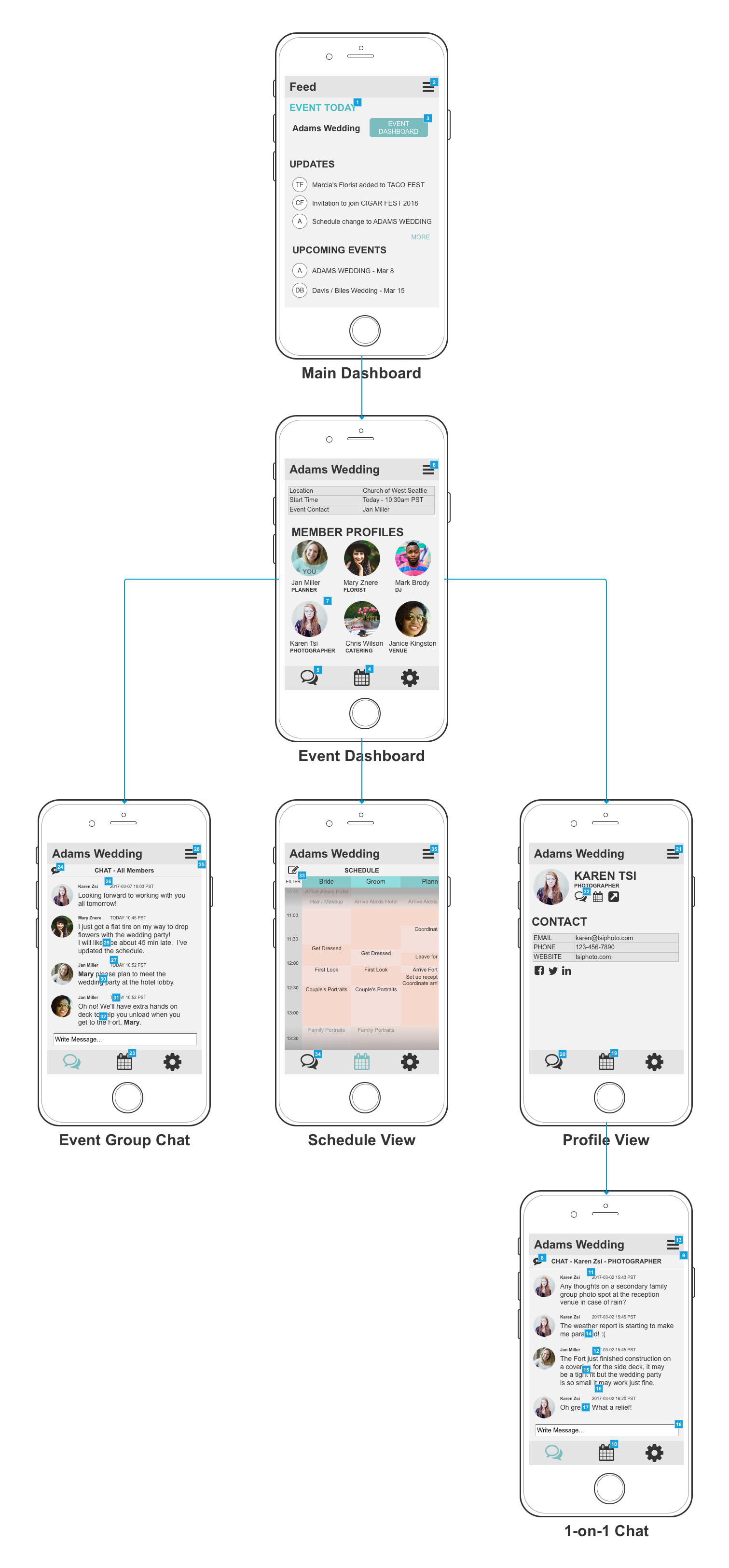
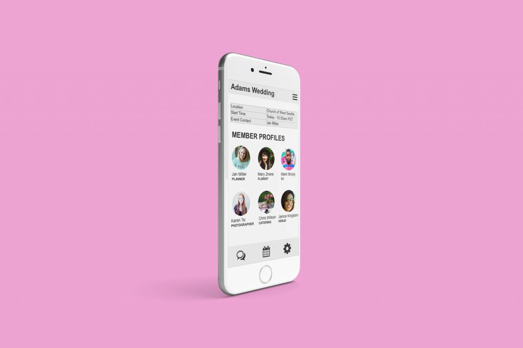
Taking into account the feedback from user testing of my paper prototype, I designed a version one set of medium fidelity wireframes in Axure. I made a user flow with these views to clarify how users might navigate these screens and be silowed into event/project ‘notebooks.’ From there I set some initially anticipated interactions to create a testable prototype.
V.01 Prototype User Testing
In user testing the prototype, I pre-screened participants at this level for those who work as event vendors or project contractors. I wanted to see how well these users were able to intuitively navigate the app and asked them to complete the following task:
TASK
You are the event planner for a wedding today. The florist is running late because of an unexpected flat tire and you need to make sure the photographer doesn’t leave the hotel for photos with the bride and groom before they receive their bouquet and boutonniere. Quickly send a message to the photographer to alert her of the situation.
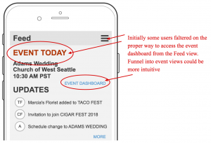
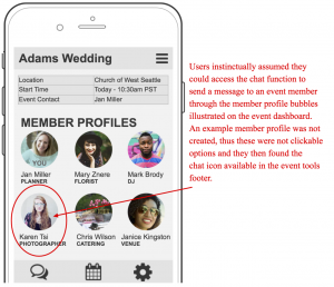
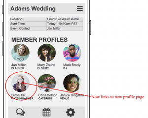
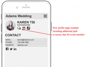
After completing the task they would then answer a serious of questions about the experience so I could get a feel for what they felt went well, what didn’t go so well, and if they could see a use for such a tool in their work. This testing revealed that the app concept resonated with the target audience and felt intuitive, but the entry funnel to silowed event ‘notebooks’ needed to be clearer and more page examples were needed to illustrate alternative navigation options that users intuitively gravitated towards (such as clicking profile pictures to access a user profiles where they expected to be able to access the 1-on-1 messenger).
V.02 Updated Prototype
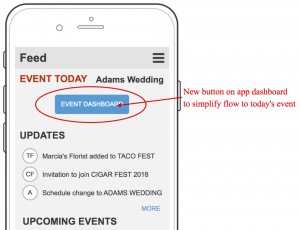
With the findings from user testing, I went back to the prototype and made some updates including adding a prominent main dashboard button leading into the day’s event view, adding example profile pages with access to the messenger, and adding a calendar view example.
Retrospective
This project is ready to move on to iterative prototyping and testing of mobile calendar functionality.
