Mary's Place Redesign
User Research, Prototyping, User Testing, UX Design
Overview
Seattle non-profit, Mary’s Place, specializes in supporting homeless women and families. Their team came to my fellow SVC students and I interested in updating their online presence with a modern website concept that would appeal to the local untapped donor base of young tech workers.
To begin this project, my initial research methods included:
- Donation Habits Survey
- Competitor Analysis
- Contextual Interview
- Affinity Mapping
This research highlighted the need for a simplified online donation process, user education as to the scope of the local homelessness problem, and a more user friendly site navigation. These needs were the focus of all my designs from sketching to prototype.
- Project TypeStudent Project
- RoleUser Research, Prototyping, User Testing, UX Design
- ToolsSketch, InVision, Balsamiq, Google Forms, Pen/Paper
- DeliverablesPresentation of Findings & Solutions
Donor History
Local to PNW
Donation Habits Survey
To get a better understanding of the user, I put together a remote survey and shared it with my personal network to collect information on donation experiences, habits, and preferences. To filter for relevant users, my twelve participants all had a prior history of donations to causes/charity and currently live or have lived in the Northwest within the past five years. The survey queried participants on details of their donation experiences, habits, and preferences.
From this data, some of the most interesting findings included:
Reasons They Give
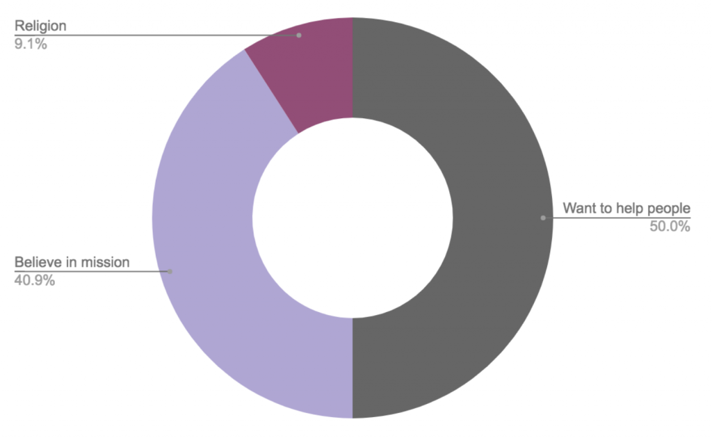
Reasons participants say they want to give:
- 50% Give because they want to help people
- 40.9% Give because they believe in a mission
- 9.1% Give for religious reasons
Factors in Choosing Where to Donate
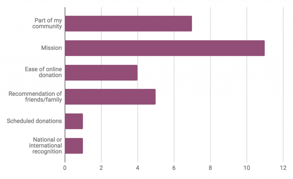
Top factors that help participants choose an organization to give their money to:
- The mission
- Part of their community
- Recommendation from friends or family
Frequency of Donation
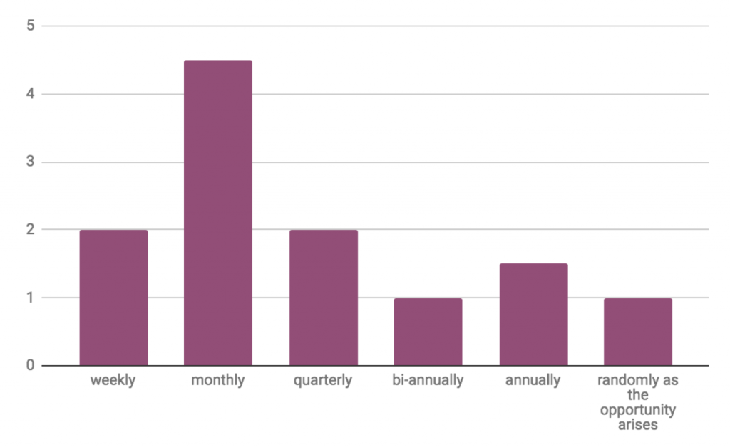
The majority of participants said they make monthly donations.
Tech worker & Photographer
Homeowners
Socially conscious
Regular Donators
Contextual Interview
With Mary’s Place’s intention to grow the target market of young Northwest tech workers, I wanted to gather some more in-depth insight into this market’s thoughts on the experience of charity donation. I was able to sit down with a relevant user couple, Krista and Phil, to get their thoughts on online donation, ease of use, frequency, and more.
Some of the most helpful takeaways I pulled from our conversation were:
Scheduled Giving
They feel more inclined to give by smaller frequently scheduled donation than by one time gifts. The idea of ‘set it and forget it’ is appealing.
Ease is Paramount
Making donation easy and fast comes up repeatedly throughout the conversation.
Make a Connection
The choice to give to an organization boils down to either:
- Believing in the mission (emotional or political connection)
- Benefitting from services of the recipient (such as KEXP or Wikipedia)
Giving as Shopping
These days, millennials are often more accustomed to the online shopping metaphor than the collection plate. They want to see the expected effect and purchasing power of their dollars.
Education
Both interviewed users had heard of Mary’s Place, but neither had a very clear understanding of what they do or the extent of the homeless crisis in the PNW community. This is a great opportunity to educate!

If it’s a small monthly donation, that is really easy. A couple coffees a month. Set it and forget it!

If I can use Paypal or Amazon Pay, that makes me feel a lot more comfortable.
I don’t like giving credit card information to third parties…
[My dislike] is security minded, but also just laziness.
The thing that probably blocks me from donating money is not being able to make that mental connection of what this $20 or $100 means.
How much of this is going to the actual cost? How much of this is overhead?
It would be nice if it was like: “You gave $20! $3 will go to infrastructure and $17 will provide 85 bowls of soup.”
Affinity Mapping
After performing an affinity mapping exercise with the issues raised from survey and interview participants, some clear concepts rose to the top:
- Donation should be exceptionally fast and easy
- Allow scheduling of repeat donations and gift donations
- Younger users in particular want to see their donated dollars “buy them”
- Forms resetting or performance issues may lead to abandonment
- Believing in the mission/cause is the #1 reason users choose to donate, thus education on the what/why is essential
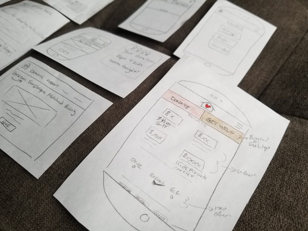
Sketching
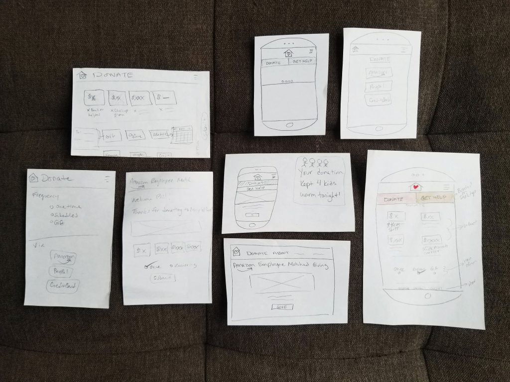
Beginning the sketching phase of this project, I used a brainstorming session to outline some of the solution needs and my initial ideas. Some of these themes included: payment choices need ‘no wallet required’ options, build in natural empathy to pull on heartstrings, reframe ‘blog’ as ‘news / stories,’ gifted donation, mobile usability, qualify dollar values in a shopping framework, ‘Donate’ button always in view, clear & easy navigation.
My sketching focussed on the journey from homepage through a more simplified donation page.
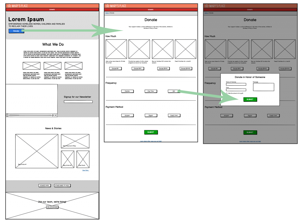
Wireframes
The wireframes I put together from sketched ideas began to show some possible homepage content display options to focus on education and moving straight to the donation page. These were then assembled into a basic clickable wireframe prototype for fast user testing.
Prototype
After observing a few users perform a basic donation task on my wireframes, I incorporated the following changes in the final prototype designs:
- The header donate button is now less obtrusive yet still a focal point
- Newsletter sign up moved so it won’t distract from educational homepage content
- Fewer buttons on Donation page
- The gift donation is now a toggle, instead of a separate frequency option
- Moved the ‘learn about other way you can help’ link to Confirmation page
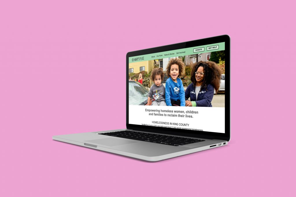
Many concepts noted from my research phases were touched on is this design, including a homepage that highlights mission education, easy button click donation, and illustration of what donation dollars are buying. The resulting prototype illustrates my suggested redesign concept and improvements to the user flow from homepage through donation and thank you confirmation pages.
Retrospective
In concluding this student project, I had the opportunity to present my research and prototype to a representative from Mary’s Place. This was a whirlwind project, but a great learning experience. In retrospect, I probably should have chosen to work with a partner so that my project scope could have been widened for the timeline we had. That being said, this was a good exercise in forcing me to limit my focus and really prioritize in what I chose to tackle to provide a quality deliverable.
In continuing to work on this project, I would like to look at research on the volunteer side of the Mary’s Place interface to inform a build out of a volunteer portal.
