User Research Study: eShakti
User Research
Overview
eShakti is an online store serving sizes 0-36W specializing in mass customization of their designer clothes for women. They provide a unique and desirable product, but seem to be less successful in attracting their target market than they could be.
The goal of my research was to discover how eShakti could better understand their users and provide them with an improved online experience. I chose to conduct four research methods that seemed well suited to reaching this goal:
- Heuristic Evaluation & Brand Analysis
- Competitor Analysis
- Contextual Interviews
- Card Sort Study (CLOSED)
- Project TypeStudent Project
- RoleUser Research
- ToolsOptimal Workshop Card Sort
- DeliverablesPresentation of Final Recommendations
Heuristic Evaluation & Brand Analysis


Lane Bryant
Competitor Analysis
You can learn a lot from the competition. Taking a look at the other players in your space is valuable. It informs about pre-existing mental models of your users, what’s working and not working for competitors, gaps in the market, and more.
During the brand analysis phase of my research, I found that eShakti’s target audience appears to be:
- Female
- Online Clothing Shoppers
- 35 to 65 years old
- Appreciate premium tailored clothing
- May have fit challenges currently underserved by much of the mainstream fashion market
online shoppers
female
35-65 yrs old
Contextual Interviews
To get a better understanding of the target market’s needs and point of view, I performed contextual interviews. My two selected participants fit within the target demographic. In advance of the interviews, I created a script of questions focused on shopping habits, attitudes, pain points, and thoughts on shopping for custom clothing.
Though my interview participants looked quite different on paper, they raised similar concerns. From our conversations I learned their top questions when considering custom clothing, how much extra these shoppers would expect to pay for custom, and perceived drawbacks of shopping online vs in-store for clothes.

I don’t take risks with shopping online, because I hate the return process.

I like sites with a lot of product reviews. Especially reviews with pictures of the item. It helps to see how it looks on somebody built like me.
22 cards
7 categories
Card Sort Study
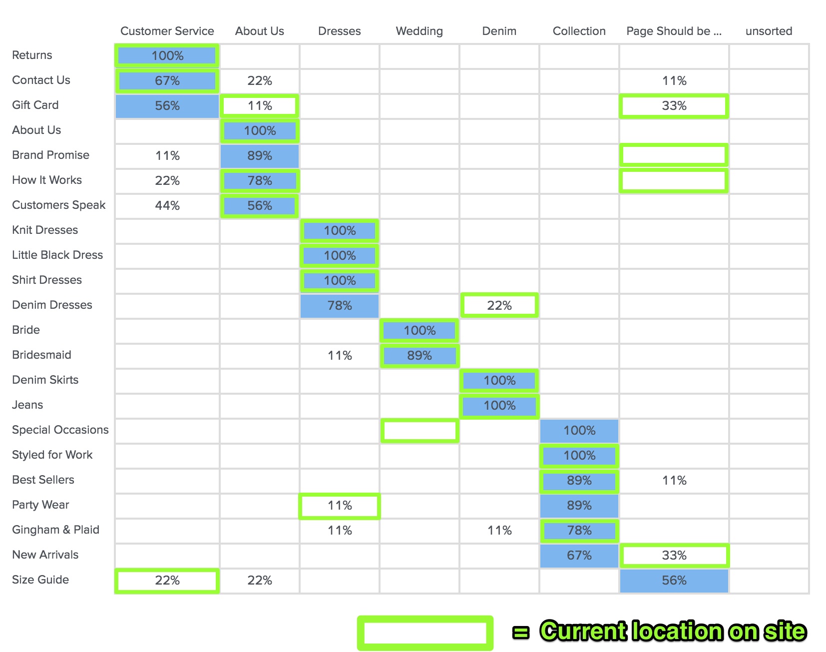
To discover how well the current site navigation was serving users, I conducted a closed card sort study via Optimal Workshop. The study consisted of nine participants placing a total of 22 cards into seven pre-named category buckets. For the site’s un-categorized pages, I created a “Page Should be Without a Category (Free Standing)” bucket to accommodate this.
In most cases, the majority of users placed pages within the same category that they are currently in on the eShakti website. This indicates that the navigation is already working quite well. The few outliers, obvious in comparison, pointed to only a few small hiccups in the current navigation scheme. Making these easy updates would move the needle to improve understandability. This observation is shown in the image below, where majority user placement is in blue and current site placement is highlighted in green.

Recommendations
After concluding my research, I compiled a list of recommendations for eShakti to improve their user experience and better target their desired audience. Here are a few of those suggestions:
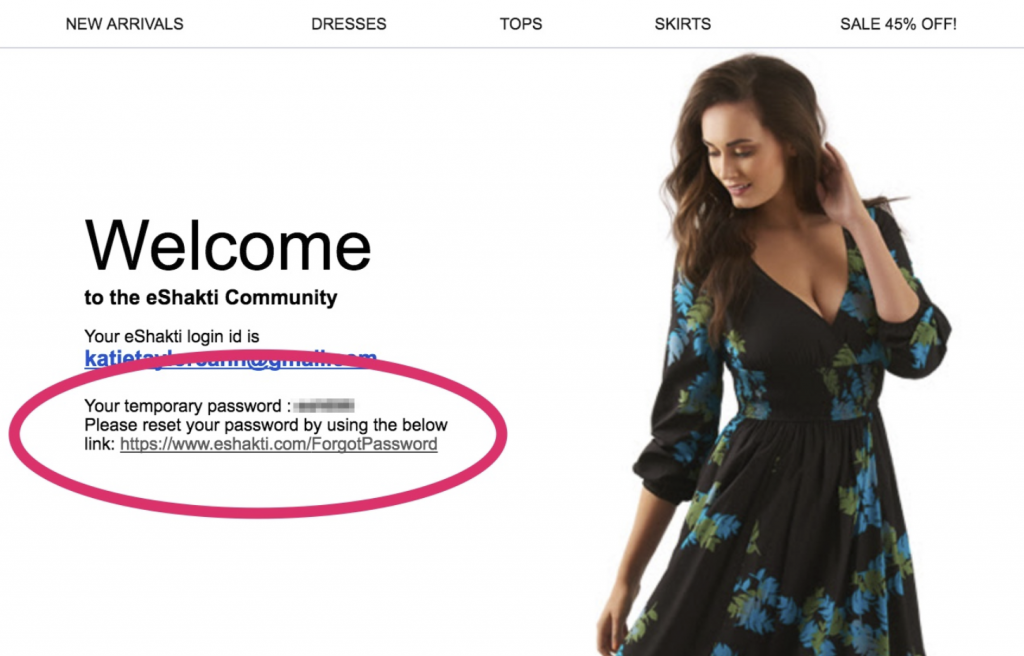
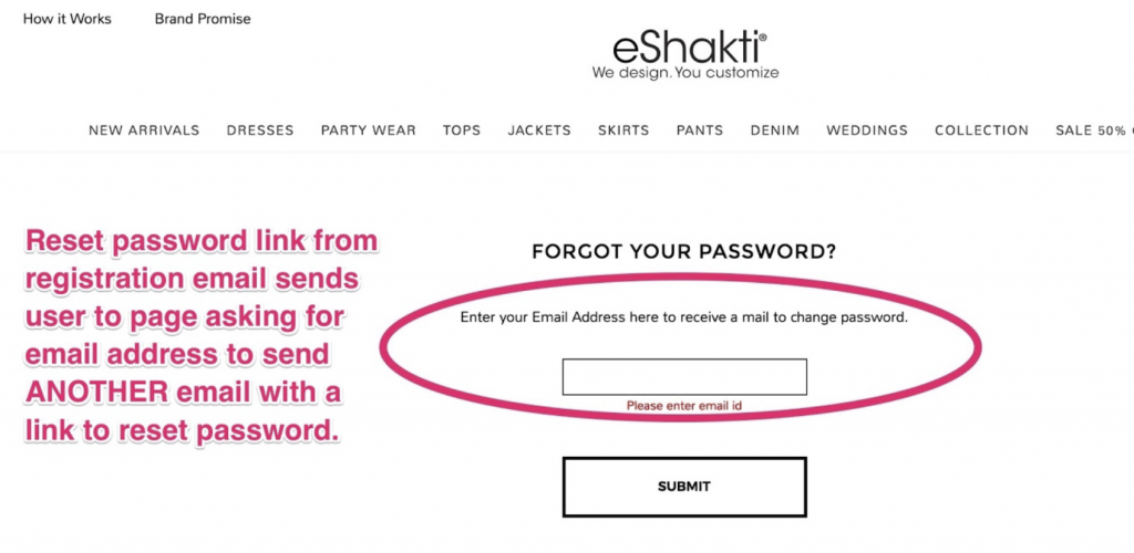
- Simplify the account creation process by removing redundant account authentication loops
- Give customers the ability to edit cart item specifications
- Add more color, motion, and excitement to the homepage to invite users to dig in deeper
- Add live delivery estimate on product detail page
- Utilize more body positive language in site marketing
- Include photos in the ‘Real People’ section embracing more varied body types
- Use incentives and reminders to encourage users to leave item reviews
- Ensure browsing and ordering process is user friendly for all supported devices and browsers
Retrospective
Through this student project I was able to gain better insight into the unique challenges of online clothing retailers and the perspective of their users.
If I had worked with this brand directly to implement my suggestions, the next step in my research would be to ask:
- How have site analytics changed since implementation? Have sales increased?
- Abandoned carts decreased? Has the bounce rate improved?
- Has the nature of customer service inquiries changed?
- What is the current rate of return customers and return users compared to before?
- Has there been any perceptible increase in customers sharing or recommending the brand?
- What are the new primary pain points for users?